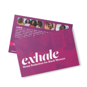
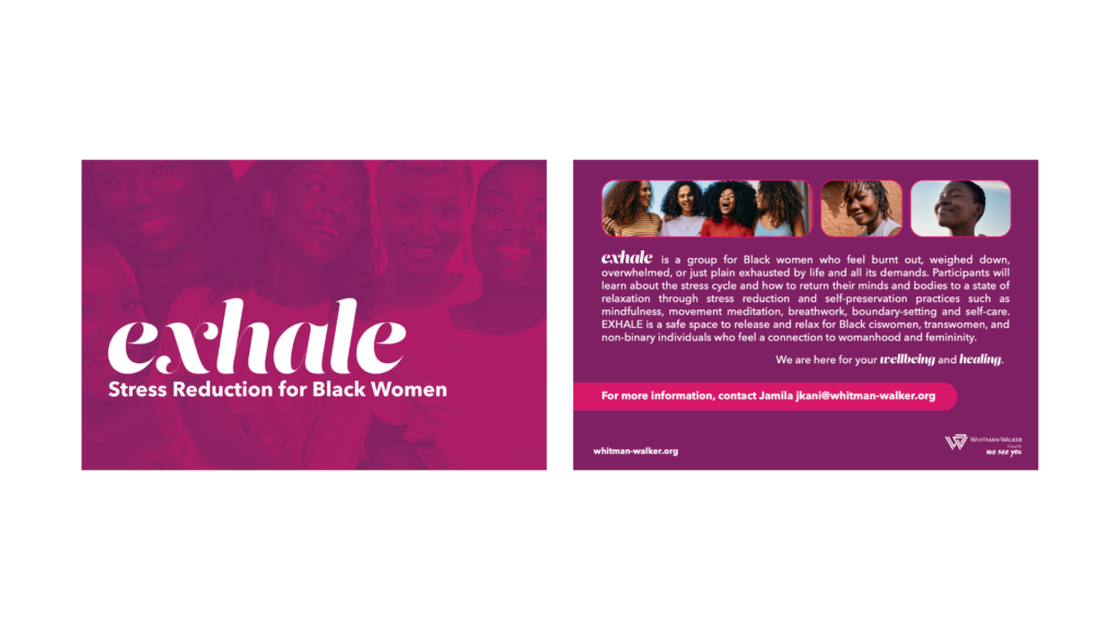
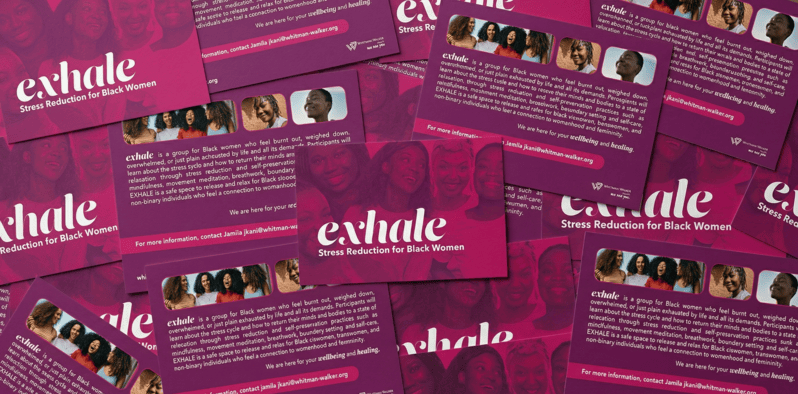
Designed an engaging palm card for Whitman-Walker Health’s “exhale” group, a program specifically focused on stress reduction, self-preservation, and holistic healing for Black women. The card needed to instantly convey a sense of safety, community, and welcome, addressing the target audience of individuals feeling “burnt out, weighed down, overwhelmed, or just plain exhausted by life and all its demands.”

The group organizer wanted a dark plum/magenta color scheme. I decided to use the overall color palette (adding in lighter fuchsia), slightly steering away from the main rainbow colors that Whitman-Walker uses in their usual branding.
Group Connection: We wanted to be mindful about imagery, ensuring they were complimentary to the name. The images selected showcase various Black women of different shades of melanin. Whitman-Walker typically uses community photos from their “We See You” campaign for all marketing materials. To stay true to that style, the images were collaged with a gradient map of the magenta colors.
Role: Lead Designer
Format: 4”x 6″Palm Card
Organization: Whitman Walker Health, Behavioral Health Department